Packaging Design
Lockdown Design Brief Challenge | Spring 2020
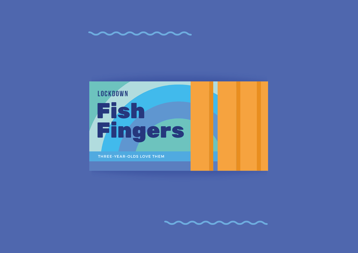
In the early days and weeks of the first lockdown, Studio Thomas set a design brief challenge on Instagram to redesign the packaging for an item of food or drink that we were stockpiling. Being a fan of Sainsbury’s own label designs from the 1960s and 70s, I used simple graphic shapes (described as ‘graphic austerity’ by Emily King, co-author of Own Label: Sainsburys Design Studio 1962–1977) and a blocky, minimalist sans serif font to represent the food item I was relying on heavily throughout those early days and weeks. A welcome distraction from the unsettling and troubling events of the time, my creation was put together on an Android phone using Canva.